exaptio exapt.io - precedents
Archive

Team Machine

2017-2021

Context

Team Machine ran from late 2017 to early 2021. The temporal workgraph had no direct precedent - holding an organisation's structure as a live graph and running ML inference against how it changed over time was genuinely novel in enterprise analytics. The interest was real. The architecture was right. The product-market fit wasn't there - not because the product was wrong, but because the processing layer that would have made it legible to buyers didn't exist yet.

The question the product was designed to answer - how does an organisation actually work, and how is that structure changing over time - turned out to require a processing layer that didn't exist yet. The thing that would have made the work graph useful at scale arrived four years after the company closed. What would have taken consultants weeks to derive from interviews could now run against a work graph in hours.

We were building memory for a brain that hadn't been born yet.

The work

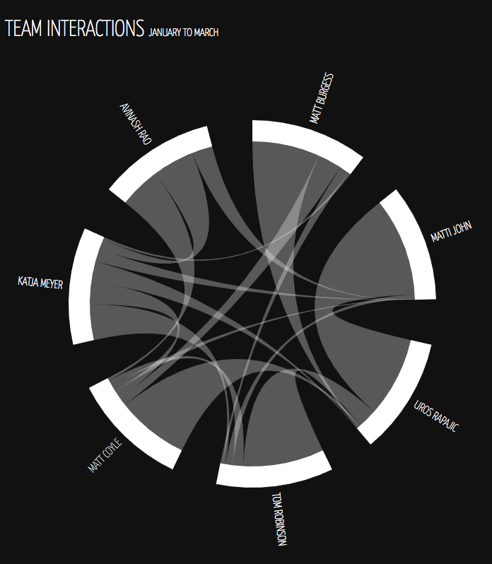
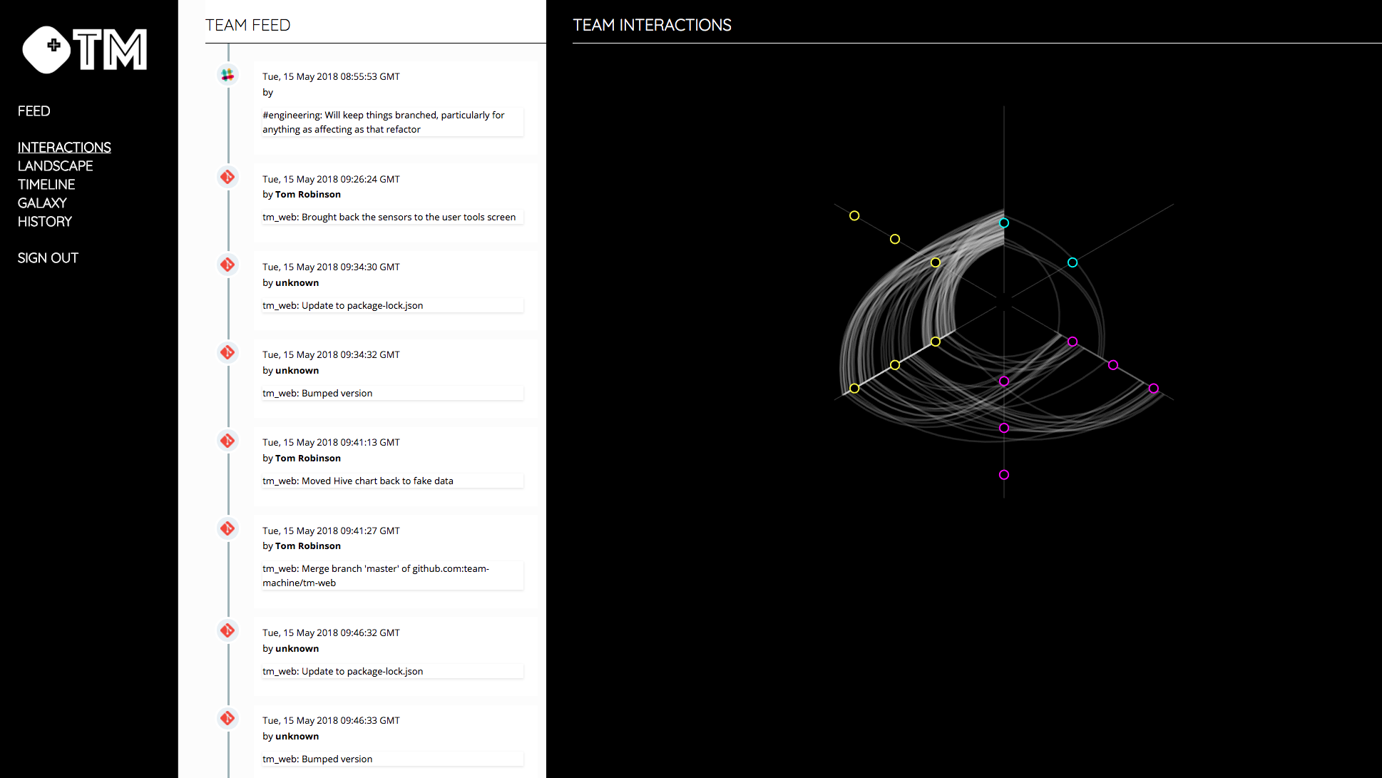
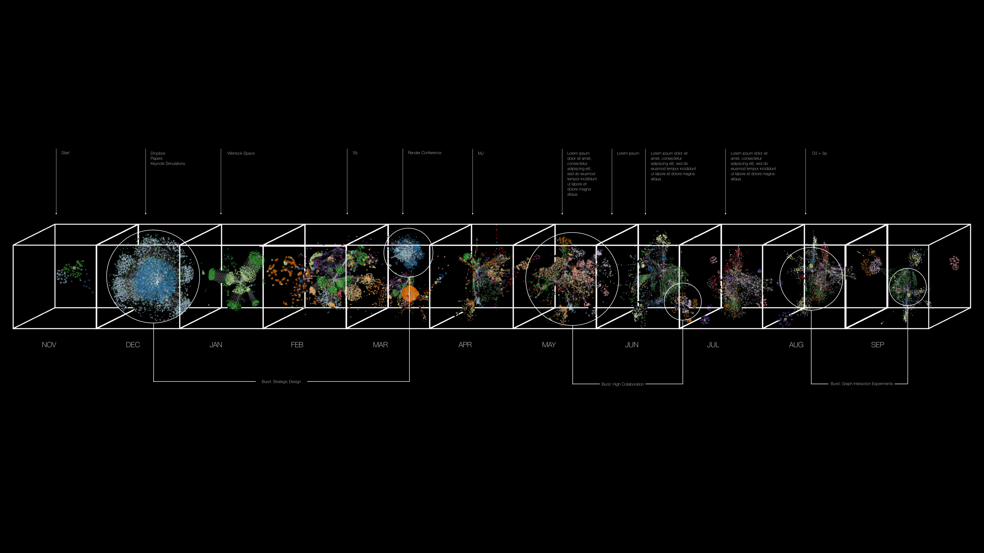
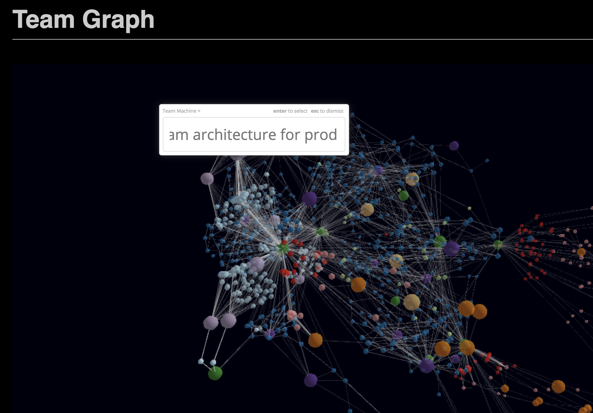
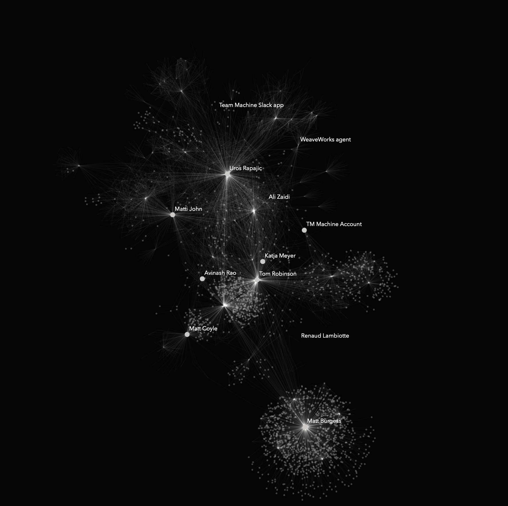
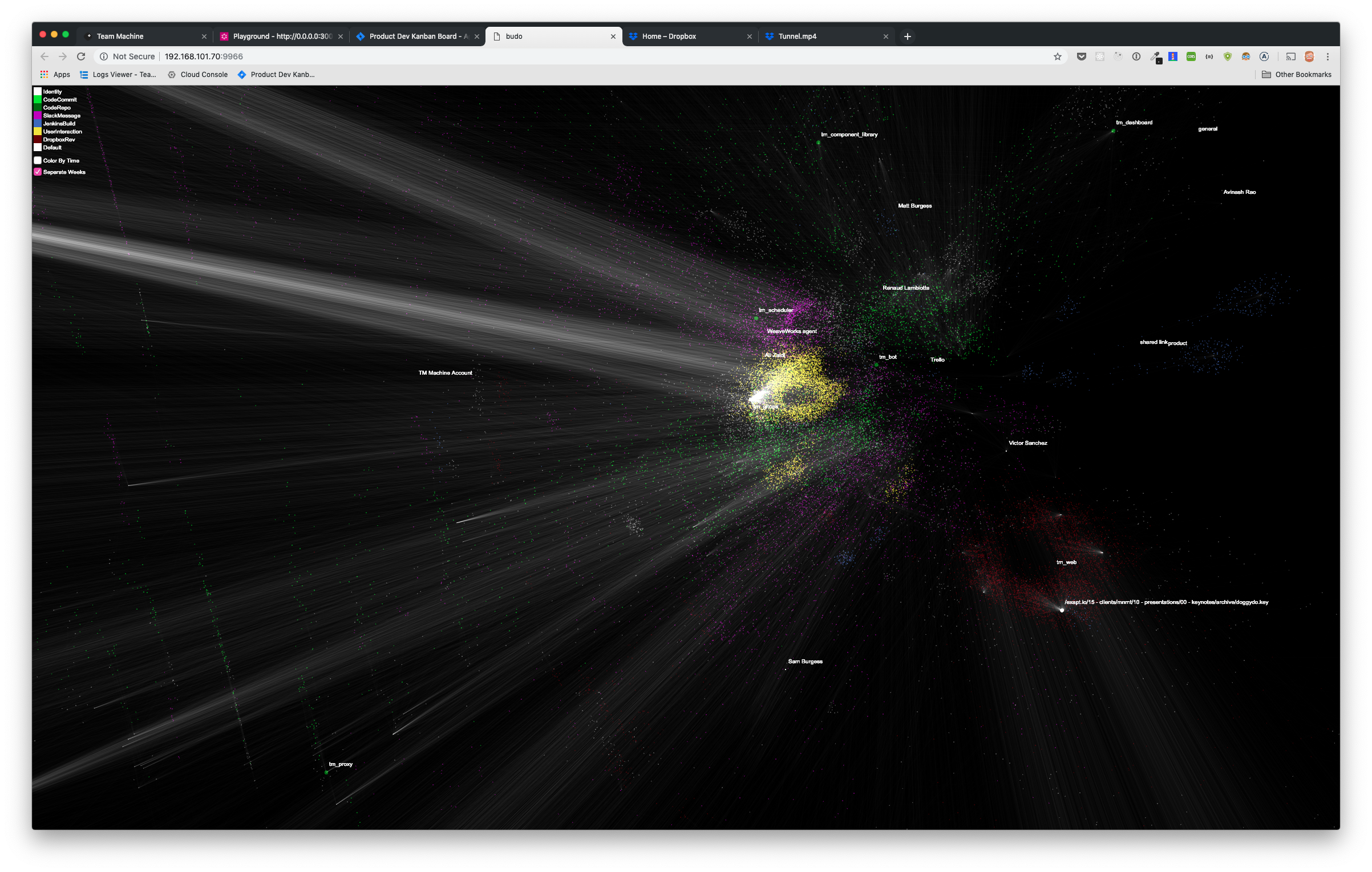
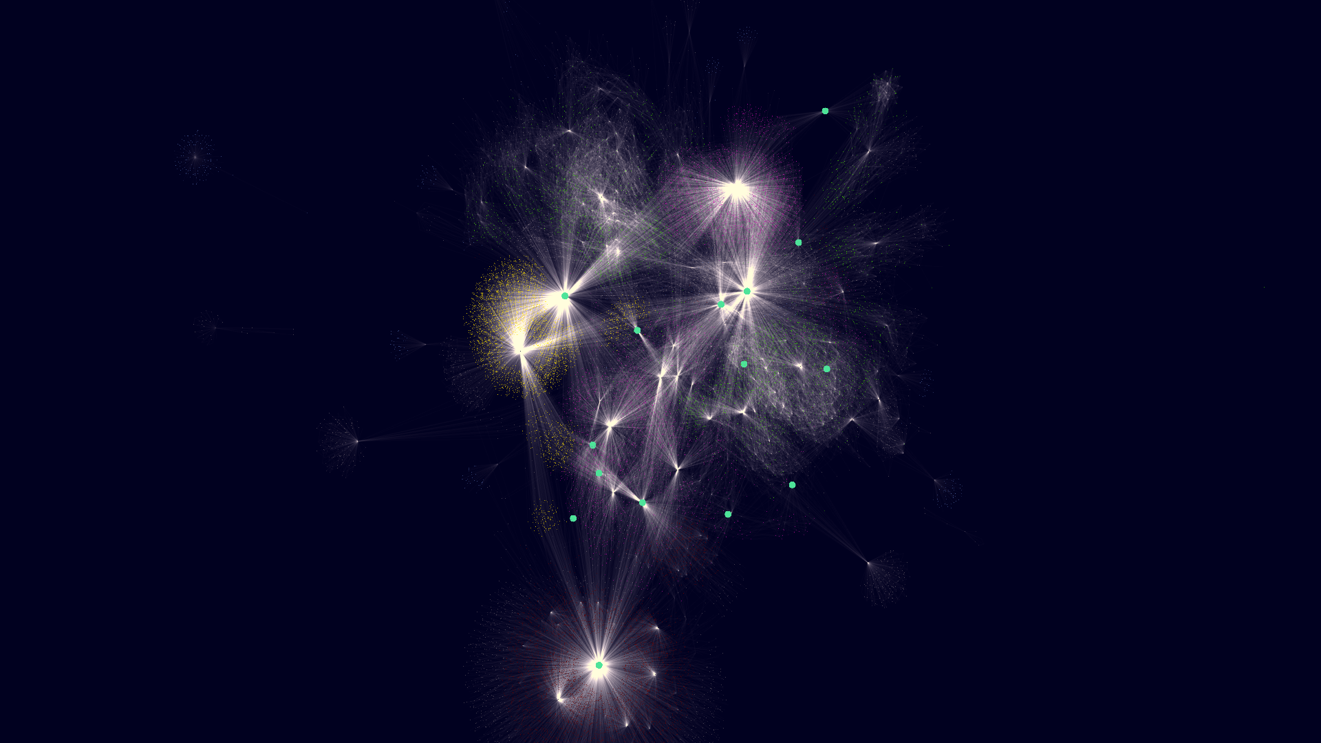
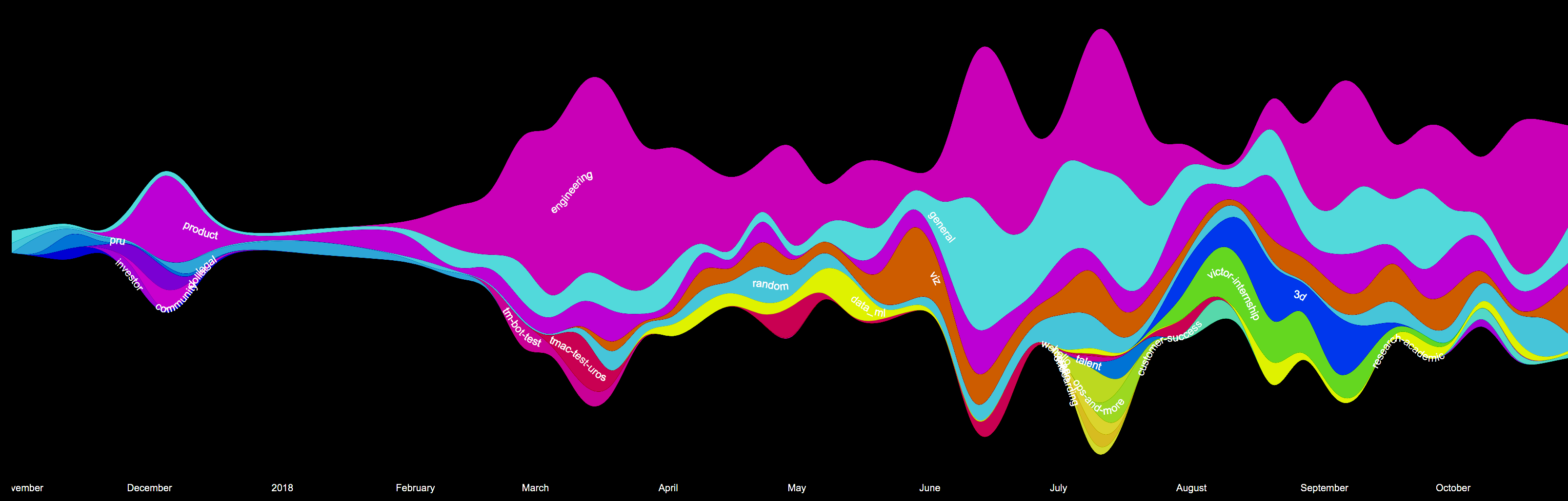
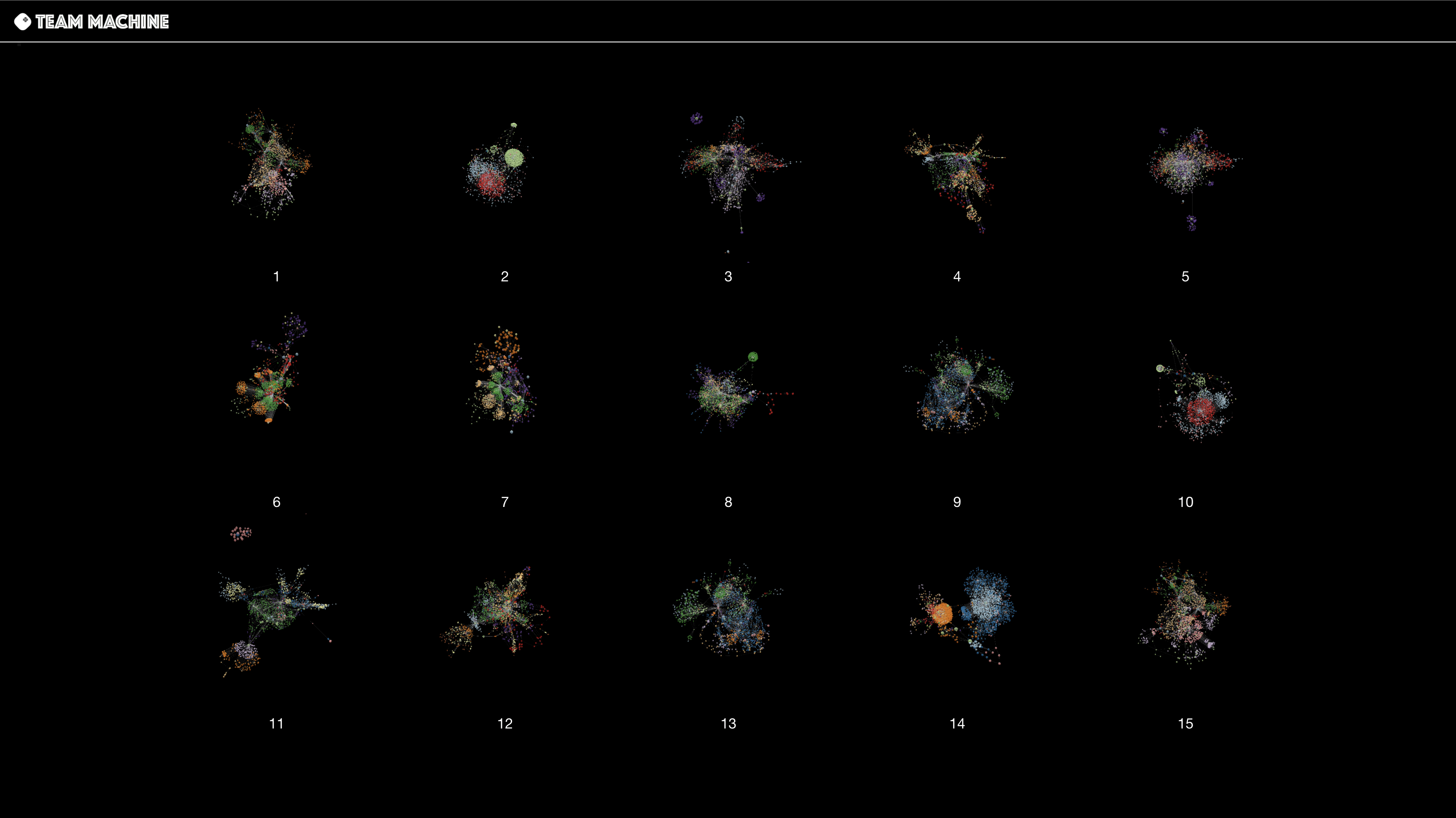
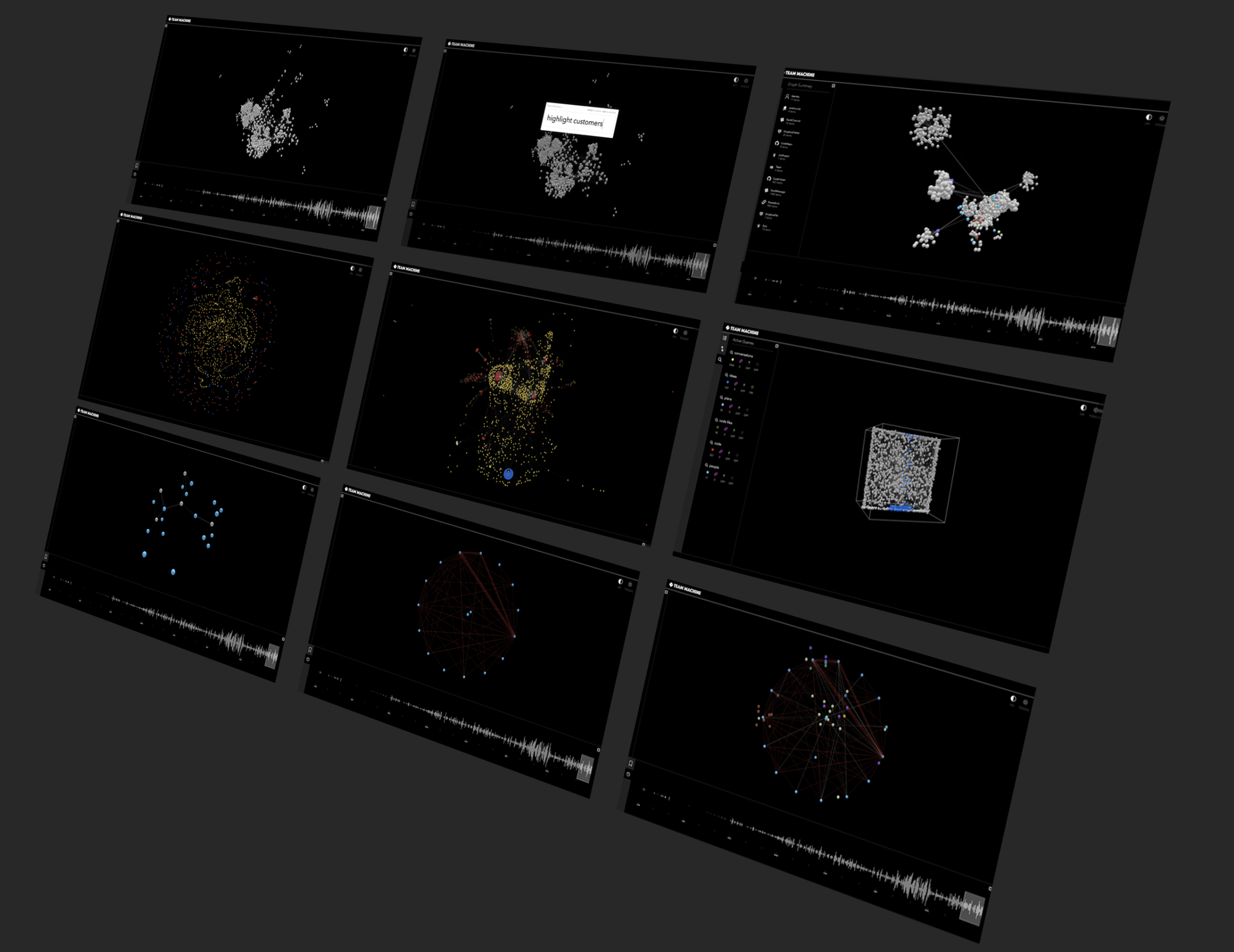
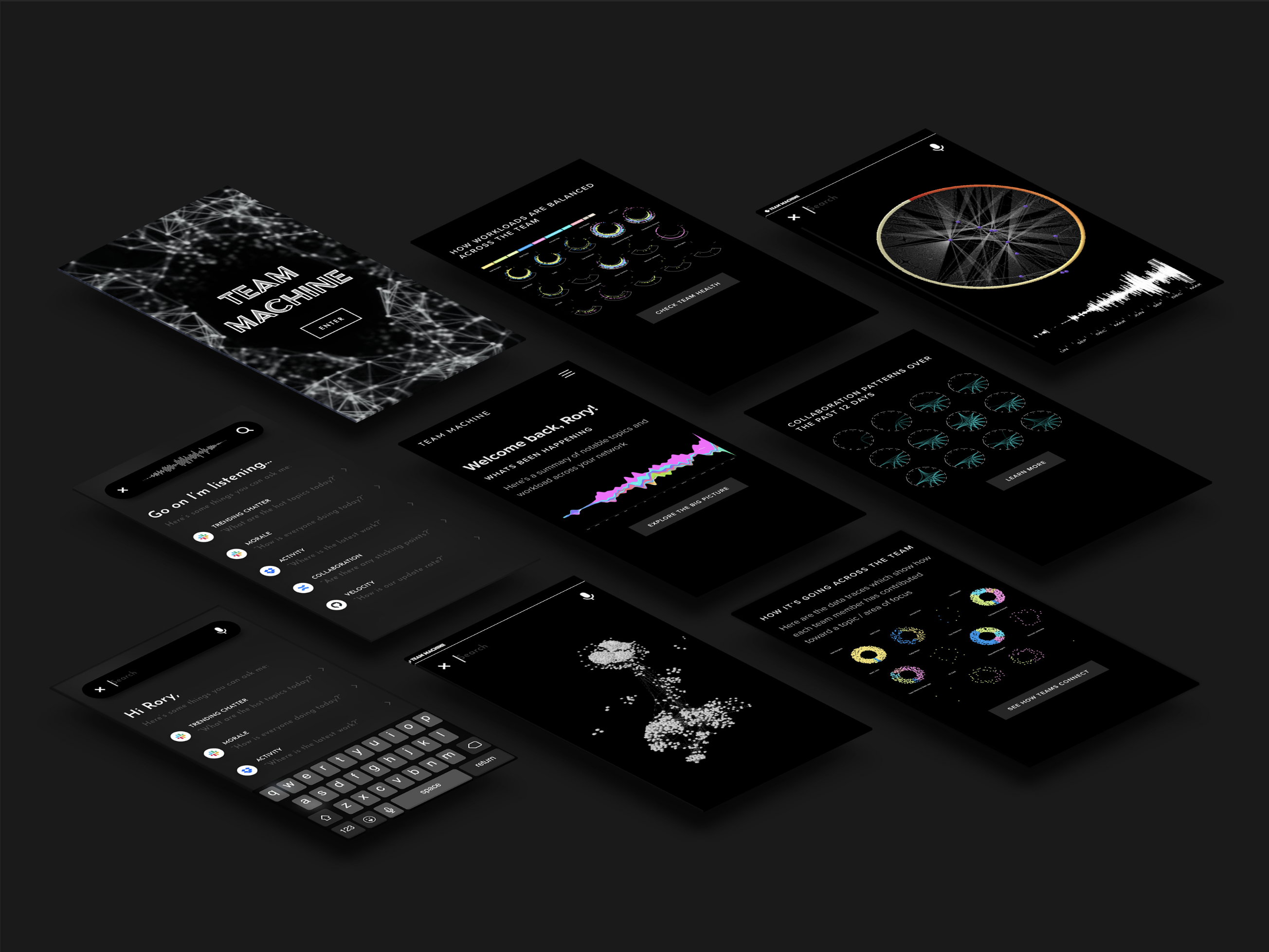
Team Machine ingested the live data traces of how an organisation worked - conversations, plans, ideas, code, releases - and held them as a real-time graph. Every event updated the graph as it happened. Who was working with whom, on what, in what sequence, across time - visible as it moved.

Both founders came to the same question by independent routes - looking at organisational graphs from different disciplines, arriving at the same gap. Why is it so difficult to see how an organisation actually works? The org chart shows the intended hierarchy. The architecture diagram shows the intended topology. Neither shows what's actually happening. The organisation is opaque to itself, and the tools designed to help were making it worse.

The answer was a work graph - assembled from the live data traces the organisation was already producing. Slack, Jira, GitHub, Dropbox, Confluence, email. The graph already existed in pieces. The infrastructure to hold it together, and to hold it across time, didn't.

Dogfood, January to March 2018

The first dataset Team Machine ran against was Team Machine itself. The company connected its own tools from the first month and used the product on its own work. What you are looking at is the founding team's interaction weight for January to March, year one: ribbon width is volume of interaction. The kind of picture that exists in every organisation and is never seen.

Team Interactions chord diagram January to March 2018 - founding team interaction weights as ribbon width

Team Interactions, January to March 2018. Chord diagram. Each segment is a team member; ribbon width is interaction volume. Team Machine running on Team Machine.

The product, June 2018

Seven months in. The feed on the left is live - commit messages and collaboration events with real timestamps from May 2018. The arc diagram on the right is the interaction graph for that day, rendered as a radial arc visualization. The navigation across the left is Feed, Interactions, Landscape, Timeline, Galaxy, History. All of it built and running against real data.

Team Machine product UI - Team Feed and Team Interactions arc diagram, June 2018

Team Machine, June 2018. Team Feed (left) and Team Interactions arc diagram (right). Real data - commit messages dated May 15, 2018 are visible in the feed.

The temporal workgraph

The defining architectural feature. Every month, a snapshot of the full work graph - every person, tool, contribution, and interaction in relation to each other. Plotted sequentially, month by month, as a set of 3D boxes. The delta between months is the signal: work spawns and fades, clusters form and dissolve, the topology of the organisation changes. Three distinct periods are legible even at a distance.

This is the concept-to-market view. Not a chart. Not a dashboard. The organisation plotted as an evolving structure, from the founding month through to a full operating year.

Team Machine concept-to-market temporal workgraph - month by month graph snapshots November through September

Concept-to-Market view, October 2018. Eleven months plotted as sequential graph snapshots. Each box is one calendar month. Three periods are annotated: Burst: Strategic Design (Dec-Jan) / Burst: High Collaboration (Jun) / Burst: Graph Interaction Experiments (Aug-Sep).

Team Graph, September 2018

The search interface. The query is "team architecture for prod" - the "te" obscured by the modal overlay. The graph responds with a subgraph: the nodes and edges that connect to the query, rendered in place. This is a 100-person organisation - 110,000 nodes in the graph dataset. The result is not a list.

Team Graph search interface - query 'am architecture for prod' returning a subgraph from a 110,000 node dataset

Team Graph, September 2018. Query: "team architecture for prod" - the leading "te" cut off by the modal. Behind it: the full work graph of a 100-person organisation, 110,000 nodes.

Visualization, February 2019

In early 2019 we commissioned Marcin Ignac of Variable Studio to render the work graph data directly. Ignac's studio - whose clients include Twitter, Google, and Nike - treats data as material. What he produced from the Team Machine graph is below.

The named graph is Team Machine running on Team Machine: the founding team as labelled nodes, Uros Rapajic as the brightest hub, each person's cluster of work visible as a distinct structure. The time series renders extend the temporal dimension - each node leaving a light trail as it moves through the months, the graph's evolution visible as comet tails and orbital paths. The streamgraph is the company's own Slack channels across the founding year: November 2017 to October 2018, channel by channel, week by week.

These were rendered from real data. The graph already existed. This is what it looked like.

Team Machine work graph - founding team as named nodes, Uros Rapajic as central hub, white particle trails on black

Team Machine work graph, February 2019. Founding team as named nodes. Visualization: Marcin Ignac / Variable Studio.

Team Machine temporal work graph - nodes as light trails through time, comet-tail trajectories on black

Temporal work graph, February 2019. The time dimension extended - each node leaving a light trail through the months. Visualization: Marcin Ignac / Variable Studio.

Team Machine work graph rendered as particle nebula - nodes as stars with lens flare, edges as light filaments

Work graph, February 2019. Visualization: Marcin Ignac / Variable Studio.

Team Machine Slack channels streamgraph - November 2017 to October 2018, channel activity as colour bands

Slack channel activity, November 2017 - October 2018. Each band is a channel; width is volume. The founding year as a waveform.

The product, April 2019

Eighteen months in. The 15-panel contact sheet below is the work graph of a client organisation plotted across fifteen consecutive months - each panel a snapshot of the full graph for that month, the topology shifting visibly as the work changed. This is what the product was built to make legible: structure as it moved, not structure as it was reported.

By this point the product had a mobile interface and multiple graph modes - the galaxy view, the arc diagram, the temporal contact sheet - each rendering a different aspect of the same underlying graph. The data was the same organisation seen at different resolutions.

Team Machine - 15-panel temporal work graph contact sheet showing fifteen consecutive months of organisation topology

Fifteen months. Each panel is one calendar month of a client organisation's work graph. The topology is the same organisation - the structure is not.

Team Machine Team Graph - nine configurations showing different organisation topologies and cluster states

Team Graph, nine states. Different organisations, different periods, different topologies - the same graph rendered across different configurations.

Team Machine mobile product composite - full app suite across multiple screens including graph, chord diagram, waveform, and team circle views

Product composite, April 2019. The full suite: graph view, chord diagram, waveform, team circles. The organisation visible across multiple modes simultaneously.

Illustration, December 2019

A commission from Marc Ngui. Ngui has spent over a decade voluntarily illustrating Deleuze and Guattari's A Thousand Plateaus - one drawing per concept, one concept at a time, entirely on his own initiative. The brief he was given was brief. Smooth flows above a striated grid.

Marc Ngui animated illustration for Team Machine - smooth sinusoidal flows above a geometric grid

Marc Ngui, December 2019. Animated illustration commissioned for Team Machine. Ngui is better known for his voluntary decade-long project to illustrate A Thousand Plateaus.